
 AI
Development
AI
Development
 Shopify
 Magento Open Source
 Adobe Commerce
 WordPress
 B2B Excellence





Why Your Ecommerce Site Is Losing Sales on Mobile (And How to Fix It Before Q4)


Your ecommerce site is losing mobile sales because of friction, not one big fault. Slow load times, confusing navigation, long checkout forms and limited payment options all contribute. Q3 is the last realistic window to fix these before Q4 traffic arrives. Once Black Friday campaigns begin and Christmas promotions go live, development teams shift from building new features to protecting website stability. That leaves very little room to fix issues that could already be costing you sales.
Mobile now accounts for most ecommerce browsing in the UK, and its share of completed purchases continues to grow. According to Found’s Ecommerce Marketing Trends report, smartphones have become the primary way consumers discover products, while Statista (2025) reports mobile devices generate 60% of UK ecommerce orders. If your mobile experience falls short, your Q4 revenue is at risk before your marketing campaigns even begin.
Effective eCommerce Website Development is no longer just about launching an attractive online store. It is about creating a fast, intuitive shopping journey that helps customers move from browsing to buying with as little friction as possible. The businesses that start improving their mobile experience now will be far better positioned when peak trading arrives.
The Q4 Opportunity: Why Mobile Is Where It’s Won or Lost
The winners of Q4 don’t wait until Black Friday to strike. By upgrading their mobile experience in Q3, they allow themselves time to discover issues, push fixes and thoroughly test before visitors and traffic reach their seasonal peak.
Black Friday, Cyber Monday, Christmas Day and Boxing Day are among the busiest online shopping days of the year. Ecommerce businesses bolster their marketing teams and budgets to meet demand with paid ads, email marketing and promotions, all in the hope of increasing traffic to their website. But more visitors won’t make a difference if your site can’t convert them into customers.
Mobile shoppers have higher expectations than ever before. They research products on their morning commute, compare prices at their lunchtime check-in and purchase whenever and however is most convenient for them. They don’t have time to wait for pages to load, understand difficult menus or navigate lengthy checkouts. When your checkout process feels sluggish, your competitors are just a few taps away.
Baymard Institute’s checkout research shows the average documented cart abandonment rate is 70.2%, and better checkout design can recover up to 35% of lost conversions. Google’s Core Web Vitals highlight page speed, responsiveness and visual stability as key metrics for ensuring a positive user experience. When combined, each element has a direct impact on your ability to convert site visitors into customers.
The problem is unlike seasonal promotions; you can’t resolve technical issues overnight. Mobile UX reviews, code updates, testing and quality control all take time to roll out. Giving yourself a head start in Q3 allows you and your team the time needed to rectify issues instead of scrambling to make hacks during the biggest shopping period of the year.
Why Is My Ecommerce Site Losing Mobile Sales?
Few ecommerce sites lose mobile sales because customers don’t like their product. Typically, websites lose sales because tiny usability frustrations occur repeatedly through the purchasing process. Eventually enough roadblocks present themselves that customers give up on buying.
Most usability frustrations are hard to catch internally because, generally, everything appears fine on the website. Images load, checkout operates and you can submit payment. But each additional tap, laggy response or confusing action/shop lifts the chances of a customer bouncing before checking out.
eCommerce Website Development is about finding these points of friction before they start affecting your bottom line. Here are some common mobile frustrations reducing conversions, especially around busy shopping periods like Black Friday and Christmas.
Why Does Slow Mobile Performance Cost You Sales?
Slow page speeds hurt conversion rates
When a shopper lands on a slow mobile website, it’s not just irritating for them. It stalls the customer’s purchasing journey. For every second your mobile site takes to load, your risk of losing that visitor increases dramatically before they make it to checkout.
Is Page Speed a Google Ranking Signal for Ecommerce Sites?
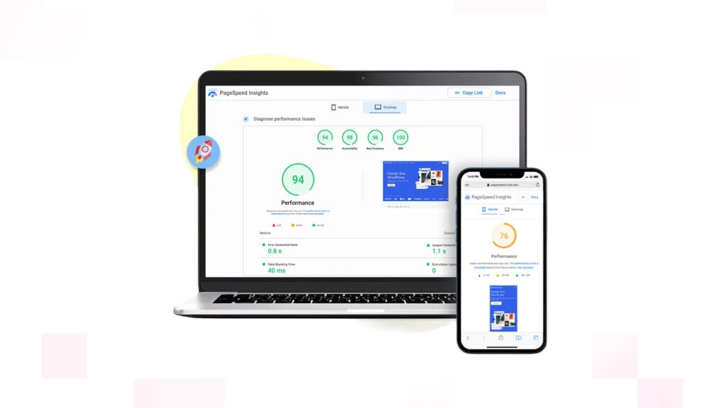
Google relies on what they call Core Web Vitals to determine a website’s user experience. LCP (Largest Contentful Paint), INP (Interaction to Next Paint) and CLS (Cumulative Layout Shift) work together to measure loading performance, interactivity and visual stability respectively.
Large images, bloated Javascript, slow servers and render-blocking third-party scripts are common culprits that negatively impact mobile page speed. When a customer visits your online store, chances are these issues aren’t apparent when browsing individually but certainly add up to slow your page down.
Addressing Core Web Vitals before the holidays approach
Optimising images, removing unused Javascript, allowing pages to be cached and keeping an eye on real user page performance are some steps you can take to ensure your site loads blazing fast. It benefits your customers not having to wait around on a slow site and it will help you in terms of SEO rankings and conversions.
Need Reliable Ecommerce Development partner to help grow your Business?
Our Experts Can Help!
How Does a Clunky Mobile Checkout Increase Cart Abandonment?
Mobile shoppers expect checkout to take under a minute. Every extra field, forced account creation or additional step raises the likelihood of abandonment.
Small screens amplify everything that gets in the way. Lengthy forms, forced account registration, vague validation messages and multiple checkout steps are tedious on any device. But when customers are shopping from their phones, those pain points push people away. Baymard’s ongoing checkout usability studies have proven again that streamlining the checkout experience is the best solution for decreasing unnecessary cart abandonment.
Streamlining isn’t about hiding information. It’s about making the checkout process feel simple. Guest checkout options, address autofill, browser Autofill, progress tracking and form fields that are easy to use on mobile devices are all examples of streamlining that don’t sacrifice security or functionality.
Ideally, you’ll thoroughly test every checkout path before the holiday rush. Every device, browser and payment method your customers might use should be tested so you can enter Q4 with confidence that your checkout is streamlined and optimised for conversions.
Poor Mobile Navigation Makes Products Harder to Find
If visitors can’t find it, they can’t buy it. Simplify navigation on mobile to guide shoppers to the product they want with the least number of taps.
On mobile sites, clumsy navigation is often borrowed from desktop websites. Deeply layered mega menus, buried categories and unreliable search boxes force extra taps that ready-to-buy visitors have no patience for.
Effective mobile navigation combines seamless menus with smart search, well-organised categories and filters shoppers can easily interact with on one hand. Including features like recently viewed, sticky navigation, and smart autocomplete can also help shoppers refine their searches instead of starting over.
Analyse how visitors use your navigation, not just how it is structured. Using analytics, session recordings, and usability testing can uncover friction points your traditional performance reports may be overlooking. The sooner you can identify and fix these roadblocks before Q4, the more time customers will spend discovering products and less time searching for them.
Non-Optimised Mobile Payment Options Create Unnecessary Friction
You want customers to complete their transaction in seconds, not minutes. Providing payment options that are familiar and optimised for mobile helps eliminate friction at the last step of the purchasing journey and decreases chances of abandonment.
It’s at the checkout stage that a customer has already acknowledged their intent to purchase, so your job is to make giving you their money as easy as possible. That’s why completing payment on clunky card forms or full-page payment gateways feels so archaic. These desktop-first solutions create pointless friction on mobile devices.
Customers today want digital wallets and express checkouts with as little typing as possible. Securely stored options like Apple Pay, Google Pay and other recognised payments mean customers can buy using fingerprint authentication or saved bank details, drastically reducing the time it takes to pay on mobile.
Payment optimisation isn’t just about accepting payments; it’s about how your payment forms look and operate. Error messages that are clear and understandable, guaranteeing customers that the page they’re entering their details on is secure with SSL certificates and that there are no hidden costs for delivery will give customers confidence and reassurance. Any hiccup during this process is another chance for the customer to walk away.
Ensuring your checkout process is fine-tuned should be part of your ongoing ecommerce website development. Optimising your checkout experience not only across different devices but also verifying your checkout process with different payments methods should be done regularly to keep your customers happy. After all, a checkout process that runs smoothly when your site is receiving regular traffic will excel when your site is hit during peak periods such as Black Friday and Christmas.
Exploring Ecommerce Website Development for Your Business?
Our Experts Can Help!
Which Trust Signals Do Mobile Shoppers Look For?
Mobile shoppers decide whether to buy in seconds. If they don’t see readily available proof that your store is legitimate, doubt may set in.
Trust signals are the reassurance cues shoppers check before buying such as review ratings, secure-payment badges, delivery times, returns policy and visible customer support.
The issue is that many trust signals get lost on mobile. At best, they’re moved below the fold. At worst, they’re tucked away under menus or buried behind unexpected clicks.
When verifying your store’s trustworthiness takes too much effort, customers often leave without buying.
By incorporating trust into your ecommerce website design and development, you can make sure these elements are easy to find. Show average review ratings near your product names. Feature shipping times above the fold. Avoid hiding returns information in dropdown menus. Validate secure payments at checkout.
Individually these are minor changes. Combined, they measurably reduce hesitation at the point of purchase.
Responsive Design Should Deliver a Consistent Experience
Responsive website design shouldn’t just shrink pages. Every click should feel intuitive, regardless of the browser or device size.
One of the most common misconceptions about mobile-friendly websites is that business owners think theirs fits the bill simply because it responds to different screen sizes. A truly responsive website takes care of a lot more functionality than flexible grids. Buttons should remain clickable (tap-able), text should be readable, forms should be effortless and images should load quickly and fit their container.
Glitches in responsive design often become apparent around busier trading seasons, when visitors are likely to be accessing your website through more devices/browser variations. Broken menus, overlapping content and misaligned Call-To-Action buttons lead to frustration and dissatisfaction with your brand.
Device compatibility checks should be an essential part of every eCommerce Web Development project. Testing your website on various operating systems, browsers and resolutions can weed out potential problems months before your customers come across them.
Intrusive Pop-Ups Can Disrupt the Buying Journey
Pop-ups shouldn’t get in the way of conversions; they should encourage them. Prompts on mobile often get in the way of customers taking even simple actions.
Cookie consent overlays pop up before many shoppers can browse a single page. Promotional banners, newsletter pop-ups and discount offer all fight for space on mobile screens.
Customers shouldn’t have to continually close overlays just to view the products they’re interested in buying. When marketing tactics create friction instead of smoothing the road to purchase, customers take notice. Bounce rates go up.
Promotional overlays are best utilised when they serve a customer who’s further along in the buying cycle. Whether it’s an exit intent offer, cookie banner or signup prompt, popup messages shouldn’t interfere with a shopper’s experience – otherwise why would they signup at all?
Pop-ups can help move customers closer to becoming leads, just make sure they’re not hindering that process. Before the holiday season hits this Q4, look at every popup on your mobile site and ask yourself: Is this helping or hurting conversions?
The Role of AI and Modern Technology in Fixing Mobile Commerce
Forward-thinking ecommerce brands are using AI to remove friction from the shopping journey rather than replacing it. The goal is to help customers find products faster, make confident decisions and complete purchases with less effort.
AI has become a practical tool for improving mobile commerce when applied to specific customer challenges. Intelligent product recommendations can surface relevant items based on browsing behaviour, while predictive search helps shoppers find products after typing only a few characters. AI-powered chatbots are also evolving beyond basic customer support, guiding users through product selection, answering delivery questions and resolving common issues without leaving the page.
Equally important is AI’s role behind the scenes. Many businesses now use AI-assisted analytics, heatmaps and session recording tools to identify where mobile users hesitate, abandon baskets or encounter usability issues. Rather than relying on assumptions, development teams can prioritise improvements using real behavioural data.
Modern architecture also plays a significant role. Headless commerce enables businesses to deliver faster, more flexible digital experiences by separating the front end from the back-end platform. Progressive Web Apps (PWAs) further enhance mobile performance by delivering app-like speed, offline functionality and smoother navigation without requiring customers to install a native application.
AI is also changing how customers discover products. Google’s AI Overviews and the growing use of conversational search mean users increasingly expect direct, concise answers before they even visit a website. Structuring product information, FAQs and category content with Answer Engine Optimisation (AEO) in mind helps businesses remain visible throughout this evolving search journey.
The brands preparing for Q4 are not adopting AI because it is fashionable. They are adopting practical technologies that reduce friction, improve usability and help customers reach checkout more efficiently.
A Practical Roadmap: What to Fix Between Now (Q3) and Q4
Improving your mobile experience does not happen overnight. Breaking the work into clear phases allows teams to deliver meaningful improvements without introducing unnecessary risk before peak trading.
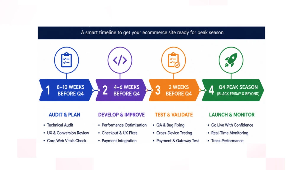
8–10 Weeks Before Peak Season: Audit and Prioritise
Start with a complete technical and UX review of your website.
Focus on:
- Core Web Vitals performance
- Mobile navigation
- Checkout usability
- Payment experience
- Product search and filtering
- Responsive design
- Analytics and conversion funnels
This stage identifies where customers are experiencing the greatest friction and helps prioritise improvements based on business impact.
4–6 Weeks Before Peak Season: Develop and Test
Once priorities are established, begin implementing the highest-impact improvements.
Typical development work includes:
- Performance optimisation
- Checkout enhancements
- Navigation improvements
- Payment integrations
- Mobile UX refinements
- Responsive design fixes
Every update should be tested across multiple devices, browsers and operating systems before deployment.
Final Two Weeks: Validate and Monitor
Avoid introducing major new functionality immediately before Black Friday.
Instead:
- Complete QA testing.
- Monitor Core Web Vitals.
- Validate payment gateways.
- Test promotional landing pages.
- Review analytics dashboards.
- Prepare rollback plans if required.
This final validation phase ensures your website is ready for increased traffic without unnecessary technical risk.
How RVS Media Approaches Mobile Ecommerce Fixes
It’s important to understand how customers browse your website vs presuming you know. Each mobile optimisation project starts with a discovery workshop at RVS Media. We also conduct technical audits and UX reviews to understand what problems are impacting your performance, usability and conversions.
We use this data to develop a prioritised roadmap based on the upgrades most likely to positively impact your business KPIs. Need to improve your Core Web Vitals scores? Want to streamline your checkout process? Search and filtering to work better? Want to optimise your payment gateways? Want to make the switch to headless commerce or Progressive Web Apps? Our recommendations are based on what matters most to your business and are backed by solid data rather than assumptions.
Changes are quality assured across devices and browsers before launch, with ongoing monitoring to maintain strong performance. In short, we test, test and test some more before your busy season starts. While agencies book up for Q4, get your mobile site performance ready with confidence at RVS Media.
Ecommerce development isn’t just about features. It’s about building a mobile shopping experience that performs when it matters most.
Conclusion
The lead up to Q4 is arguably the most precious stretch of the ecommerce calendar. Although it’s understandable that marketers want to dedicate most of their time polishing campaigns, they can’t sell products that your website doesn’t convert.
By elevating performance, streamlining checkout, solidifying navigation and eliminating friction, your mobile site or app will convert more visitors throughout Black Friday, Cyber Monday and Christmas shopping. But making these improvements takes time – you’ll need to plan, develop and test – so now is the time to start.
Want to know if your site is ready for the big rush? Q3 is the perfect opportunity to find out.
If your mobile conversion rate could be better, or analytics are showing high cart abandonment during crucial stages of the buying process, hire a professional to identify the causes.
A mobile site or app audit will highlight the elements sabotaging your sales and provide you with a bespoke plan to make things right. Implementing these changes before Q4 hits means your business can tackle the busiest trading period of the year equipped with a faster, more robust ecommerce experience that’s fit for customer demand.
Frequently Asked Questions
Most ecommerce websites lose mobile sales because of friction throughout the buying journey rather than a single major issue. Slow page speeds, confusing navigation, lengthy checkout forms, limited payment options and poor mobile usability can all discourage customers from completing their purchase. A mobile UX audit can help identify where users are dropping off and which improvements will have the greatest impact.
Mobile devices now account for the majority of ecommerce website traffic in the UK, with smartphones playing a central role in how consumers discover, compare and purchase products. Research from Found and Statista shows that mobile continues to generate a significant share of ecommerce visits and an increasing proportion of completed orders, making mobile optimisation essential for online retailers.
Start by identifying the issues that create the biggest barriers to conversion. Prioritise Core Web Vitals, mobile page speed, checkout usability, navigation, search functionality and payment options before moving on to design refinements. Addressing these high-impact areas early gives you enough time to develop, test and validate changes before Black Friday and Christmas trading begin.
Timeline will vary depending on the size of your site and issues involved. Performing the audit and UX review can typically be done in a matter of days. Making improvements will take longer depending on development needs. Q3 should give you enough time to make the improvements, quality assurance and perform any performance testing before busy trading occurs.
Not necessarily. Many businesses can improve mobile performance through targeted eCommerce Website Development rather than a complete rebuild. Optimising Core Web Vitals, simplifying checkout, improving navigation, enhancing payment options and refining the mobile user experience can often deliver significant improvements without replacing the entire website.
Optimising your mobile UX removes friction across the customer journey which means that more site visitors will be able to reach the point of purchase. Quicker loading pages, simplified navigation and easy checkout will increase conversions, lower cart abandonment rates and boost revenue from your existing traffic. Plus, making these changes before Black Friday means you won’t have to worry about site errors slowing you down during the busiest shopping day of the year.