 AI
Development
AI
Development
 Shopify
 Magento Open Source
 Adobe Commerce
 WordPress
 B2B Excellence





Designing for iOS 26’s Liquid Glass: What’s Changed and How to Update Your App UI


When Apple released iOS 26 in September 2025, it introduced the most significant visual shift to its software experience in years. Liquid Glass now shapes controls, navigation, app icons, widgets and other system interfaces, with a design language that extends across Apple’s platforms.
For app owners, though, the interesting question is not whether glass effects look attractive.
The real question is what iOS 26 changes for an app that already exists.
What does iOS 26 change for an existing app?
iOS 26 changes three things for an existing app: how content and controls are layered, how navigation behaves on scroll, and how much of the visual language native components handle automatically.
That makes iOS 26 a design and development consideration, not simply a new visual style.
What Is Different About iOS 26 Liquid Glass?
Liquid Glass is a dynamic material that combines translucency with fluid visual behaviour. It can reflect and refract surrounding content, adapt to context and respond to movement and interaction. Apple introduced it across iOS 26, iPadOS 26, macOS Tahoe 26, watchOS 26 and tvOS 26.
For iOS apps, three changes deserve particular attention.
How do controls change in iOS 26?
According to Apple’s Human Interface Guidelines, Liquid Glass is a functional layer for controls and navigation that sits above the content layer. Tab bars, sidebars and similar elements can allow content to remain visible underneath them while maintaining a clear distinction between navigation and the information users are consuming.
In iOS 26, content stays the focus while controls sit above it in a separate functional layer.
Content remains the focus. Controls support the content.
That distinction is important when redesigning an existing application.
Navigation behaves more dynamically
In iOS 26, tab bars can shrink as users scroll, giving more visual space to the content, then expand again when users scroll toward the top. Apple has applied similar thinking to navigation and toolbars across its platforms.
Navigation is therefore no longer something designers can consider purely as a fixed object at the bottom or top of a screen.
Its behaviour becomes part of the experience.
How iOS 26 Changes UI/UX Design
But this is where things start to matter more at the product level.
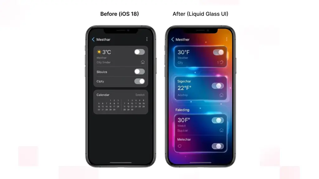
iOS 26 UI/UX design isn’t about “making round corners in Figma to mimic Apple’s glass texture”. Designers need to rethink how hierarchy works, states interact, navigation behaves and how content responds to system gestures.
Should Liquid Glass be applied to content?
Apple has been clear with their current guidance. Don’t make Liquid Glass your default treatment for the content layer.
Applying it to every card, list row or container can create unnecessary visual complexity and weaken hierarchy. Liquid Glass is intended primarily for functional elements that sit above content.
For designers, this means separating an interface into two conceptual layers:
Content layer: products, articles, images, dashboards, lists, maps and other information.
Functional layer: navigation, toolbars, tab bars, floating actions and other controls.
The glass belongs primarily to the second layer.
This is also reflected in practical experimentation with custom Liquid Glass interfaces. Applying the material indiscriminately to content elements can make the interface feel cluttered, while using it for floating controls and navigation creates clearer depth and hierarchy.
How do you design for iOS 26 interaction states?
A traditional mobile app design handoff might show a polished screen at rest.
iOS 26 demands more questions:
- What happens when the user scrolls?
- When does navigation become less prominent?
- How does a toolbar behave over different content?
- What happens when a control expands?
- How does a translucent element behave over photography?
- What changes in dark mode?
- What happens with larger text?
- How does the interface respond to accessibility settings?
- This makes interaction states part of iOS 26 UI design.
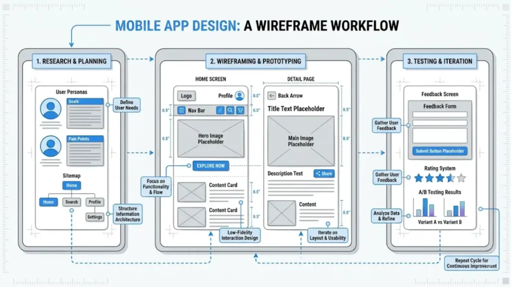
Wireframes and prototypes become particularly valuable because designers need to validate not only what an interface looks like, but how its layers move and behave together. Practical iOS 26 design guidance similarly emphasizes starting with structure and wireframes before applying the visual treatment.
Planning an iOS 26 redesign?
Talk to our iOS design and development team.
Liquid Glass Design Guidelines for Existing Apps
A good iOS 26 app redesign does not mean replacing every component.
It means identifying where the existing experience conflicts with the new platform conventions.
Where should an iOS 26 redesign start?
Audit:
- Tab bars
- Navigation bars
- Toolbars
- Search
- Sidebars on iPad
- Floating actions
- Sheets and presentations
- Menus
These areas are most likely to reveal inconsistencies because Apple has significantly updated how navigation and controls behave.
If an app has a heavily customised navigation system, compare it with Apple’s native behaviour before deciding to preserve the custom implementation.
Be selective with custom Liquid Glass
Use the system behaviour wherever possible. Customise where the product experience genuinely requires it.
When should you use clear versus regular Liquid Glass?
Not every background is suitable for a highly translucent control.
Apple provides regular and clear Liquid Glass variants. The regular variant provides more protection for legibility, while the clear variant is intended for visually rich backgrounds such as photos and video. Apple also provides specific guidance for maintaining contrast when using clear Liquid Glass over bright content.
So the decision should not be:
“Which glass effect looks better?”
It should be:
“Which treatment keeps this control understandable in every context?”
How iOS 26 Changes Mobile App Development
The visual changes have a direct technical consequence: mobile app development must account for more system-managed behaviour.
Apple’s standard SwiftUI, UIKit and AppKit components can automatically adopt the latest Liquid Glass appearance and behaviour. Existing apps should therefore be built with the latest SDK and tested before developers start replacing components unnecessarily.
Native components become more important
For an app using standard navigation, controls and tab views, the migration may be relatively straightforward.
For an app built around years of custom UI, it can be more involved.
Developers may need to review:
- Custom tab bars
- Navigation containers
- Toolbars
- Buttons and controls
- Search interfaces
- Modal presentations
- Custom animations
- Fixed layouts
- Edge-to-edge content
- Accessibility behaviour
The goal is not to rewrite the application simply because iOS 26 exists.
It is to identify where custom code is now working against platform behaviour.
Looking for a Technical Partner in Your Digital Transformation Journey?
Our Experts Can Help!
What Happens If You Do Nothing?
Nothing catastrophic happens simply because an existing app has not been redesigned.
However, building the app with the latest SDK can change the appearance of standard components automatically. Apple recommends running an existing application with the current SDK to see how it behaves before determining the scope of the migration.
Without a proper review, you may end up with an inconsistent experience:
- Native components follow iOS 26 conventions while custom components retain older styling.
- Fixed navigation patterns clash with adaptive system behaviour.
- Translucent controls create contrast problems over complex backgrounds.
- Custom animations feel disconnected from system interactions.
- Content and controls compete for visual attention.
The problem is therefore less about an app looking “old” and more about the interface speaking two different design languages.
Which Screens Should You Update First?
A complete redesign is rarely the most sensible first move.
Prioritise screens according to user exposure and business importance.
1. Primary navigation
Review tab bars, navigation and major toolbars first.
2. High-value journeys
Next, examine flows such as:
- Login
- Search
- Checkout
- Booking
- Purchasing
- Account management
These journeys combine high user exposure with measurable business impact.
3. Heavily customised components
Find the parts of the app where custom UI differs most from Apple’s current conventions.
4. Content-heavy screens
Check whether content remains visually dominant when controls float above it.
5. Secondary screens
Settings, help and lower-traffic areas can be addressed after the core experience is stable.
This staged approach reduces unnecessary redevelopment while allowing teams to focus on the areas users actually notice.
A Practical iOS 26 App Redesign Checklist
Before releasing an updated app, review:
- Current Xcode and SDK compatibility
- Primary navigation behaviour
- Tab bar and toolbar behaviour
- Custom components
- Content versus functional-layer hierarchy
- Liquid Glass usage
- Light and dark appearances
- Dynamic Type
- Increased contrast
- Reduced transparency
- Complex backgrounds
- Scrolling and transition behaviour
- Different device sizes
- Older supported iOS versions
- High-value user journeys on physical devices
The objective is not to make an app look as though every surface is made of glass.
It is to make the interface feel like it belongs on iOS 26 while keeping the product’s own identity intact.
The Bigger Shift for App Teams
The most important change may not be visual at all.
iOS 26 brings UI/UX design and mobile app development closer together.
The designer should know what the platform can do by default. The developer should know how the user should interact with the application versus building what they see on a screenshot.
Take hiding a navigation bar as content scrolls for instance. Instead of building a custom animation to hide that bar when scrolling, we as a team can ask if Apple didn’t have a solution to this problem already.
Through that collaboration we can build a more seamless iOS experience and eliminate unnecessary custom code.
This is where an experienced design and development team shines with legacy applications. Not because your app needs to be re-designed and rebuilt from scratch, but because sometimes the right course of action is knowing what to migrate, what to keep, and what Apple will do for you.
No. Apple specifically recommends building the existing app with the latest SDK first and assessing how its current components respond. Many standard components automatically adopt the new appearance.
Start with primary navigation, tab bars, toolbars and high-value user journeys. Then review heavily customised controls and content-heavy screens.
Not necessarily. However, custom components may look inconsistent beside native iOS 26 components or fail to take advantage of the new interaction patterns.
Generally, no. Apple’s current guidance says Liquid Glass should primarily form a functional layer for controls and navigation rather than being applied throughout the content layer.
Yes. It:
- Reduce Transparency
- Increase Contrast
- Motion-related accessibility settings
- Preferred Liquid Glass appearance
No. Apple introduced the design language across iOS 26, iPadOS 26, macOS Tahoe 26, watchOS 26 and tvOS 26, although the appropriate interaction patterns differ between platforms.
Treating Liquid Glass as decoration.